

Willkommen auf den Seiten der


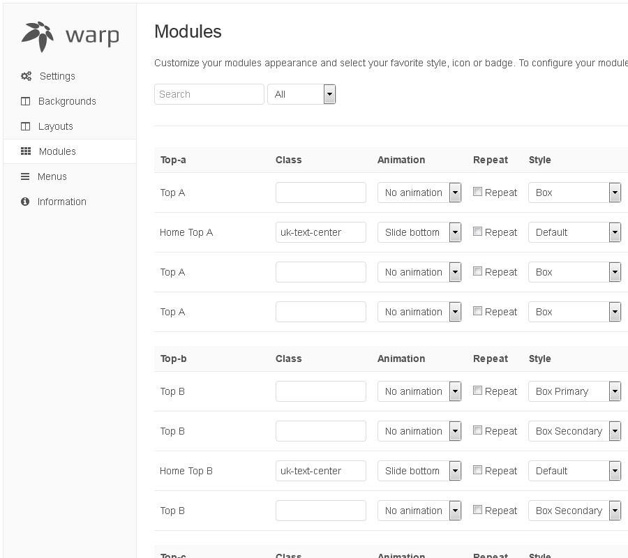
Module Variations
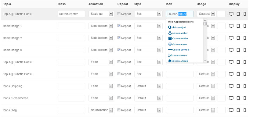
This theme comes with different module styles, badges and icons. For each module you can pick a style and combine it with an icon or badge to create your own unique look. Here is a list of the available options:
| Class: | uk-text-center, headline-border |
| Animation: | No, Fade, Scale Up, Scale Down, Slide Top/Bottom/Left/Right |
| Repeat: | On, Off |
| Style: | Default, Box, Box Primary/Secondary, Header, Space, Blank |
| Icon: | 500 Icons (Font Awesome) |
| Badge: | Success, Warning, Danger |
| Display: | Desktop, Pad, Phone |
UiKit
Headline
Lorem ipsum dolor sit amet, consectetur adipisicing elit, sed do eiusmod tempor incididunt ut labore et dolore magna aliqua. Ut enim ad minim veniam, quis nostrud exercitation ullamco laboris nisi ut aliquip ex ea commodo consequat. Duis aute irure dolor in reprehenderit in voluptate velit esse cillum dolore eu fugiat nulla pariatur. Excepteur sint occaecat cupidatat non proident, sunt in culpa qui officia deserunt mollit anim id est laborum.
Article title
Lorem ipsum dolor sit amet.
Lorem ipsum dolor sit amet, consectetur adipisicing elit, sed do eiusmod tempor incididunt ut labore et dolore magna aliqua.
<div class="myclass">...</div>
text-muted
text-info
text-success
text-warning
text-danger
text-info
text-success
text-warning
text-danger
ins element
mark element
abbr element
dfn element
mark element
qinsidea q element
abbr element
dfn element
Badge 1 Success 4 Warning 3 Danger 4
h1
h2
h3
h4
h5
h6
Lorem ipsum dolor.
Someone famous
- List item 1
- List item 2
- List item 3
- List item 1
- List item 2
- List item 3
| Table | Heading |
|---|---|
| Table | Data |
| Table | Data |
- Description lists
- Description text.
- Description lists
- Description text.
All UIkit Typo, Core & Compontents
Dummy Content
test -Lorem ipsum dolor sit amet, consectetur adipisicing elit, sed do eiusmod tempor incididunt ut labore et dolore magna aliqua. Ut enim ad minim veniam, quis nostrud exercitation ullamco laboris nisi ut aliquip ex ea commodo consequat. Duis aute irure dolor in reprehenderit in voluptate velit esse cillum dolore eu fugiat nulla pariatur. Excepteur sint occaecat cupidatat non proident, sunt in culpa qui officia deserunt mollit anim id est laborum.
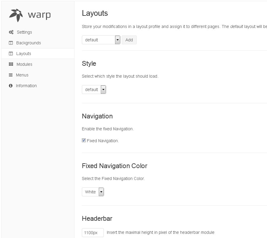
Features
The general theme section allows you to control the behaviour and the overall appearance of your theme.
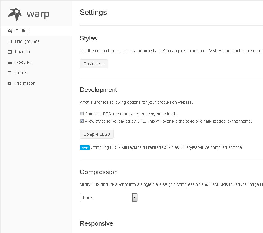
Style
The style section contains the customizer. Hit the Customizer button to add your own style or to modify an existing style. After the customizer is loaded, you can easily customize colors, fonts, margins and even more settings of the theme. The customizer saves only the modified variables and automatically compiles them into CSS.
Screenshots
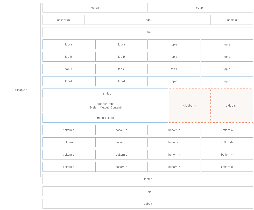
Module Positions
Module Layout
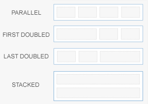
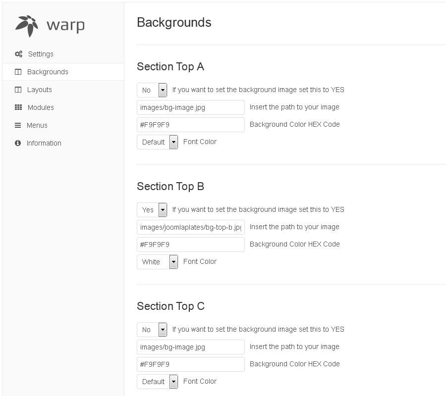
This theme comes with a lot of module positions. The blue module positions allow to choose a module layout which defines the module alignment and proportions:
PARALLEL, FIRST DOUBLED, LAST DOUBLED, STACKED
Column Layout
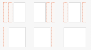
The two available sidebars, highlighted in red, can be switched to the left or right side and their widths can easily be set in the theme administration.
For modules in the blue and red positions you can choose different module styles. Take a look at the module variations page to get an overview.
Module Positions
Author
May 2, 2090 at 1:55 pm
Lorem ipsum dolor sit amet, consetetur sadipscing elitr, sed diam nonumy eirmod tempor invidunt ut labore et dolore magna.